Good deck color ideas usually start with samples, stain charts, and saved photos. That part is fun, but it is also where many homeowners get stuck. A color can look great on a small sample and still feel off once it covers the full deck surface. The reason is simple. Deck design is not just about color. It is about shape, board direction, railing lines, transitions, light, and how the whole thing relates to the home’s exterior and even the home’s interior design.
Deck Framing Shapes More Than Most People Expect
People usually think of deck framing as a structural issue, and that is true. In New Jersey, especially, it also has to deal with moisture, rot, freeze-thaw movement, and, in some areas, stronger corrosion exposure near the coast. It also affects appearance in ways people do not always notice at first.
The spacing of every deck board, the direction of each board, the position of posts, the width of the staircase, and the line of the railing all influence how a finished deck color reads. A narrow platform with awkward angles can make a darker tone feel heavy, while a wide, balanced, or square layout can make the same color feel grounded and refined.
Deck Design Works Best When Deck Color Follows the Layout
Strong deck design usually feels clear before the stain or composite shade is chosen. The deck should have a focal point, natural flow, and proportions that fit the outdoor living space.
For example, a simple rectangle can often handle deeper browns or a rich brown finish because the form is already calm and balanced. A more complex layout with multiple levels, a staircase, or built-in features may need subtler hues so the space does not feel busy. In practice, color should support the frame, not compete with it.
That is one reason homeowners looking for a polished result often benefit from working with a deck design and build team that can think about structure, materials, and appearance as one complete job instead of three separate decisions.
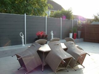
Why a Two-Tone Deck Can Look So Good in an Outdoor Space
A well-planned two-tone deck can add visual interest without feeling forced. Too much contrast can create a striking contrast in the wrong places and break the space apart. The better approach is to let one tone lead and use the second tone to define edges, steps, or a seating zone.
A two-tone deck design often works best when the layout already has clear lines. The main deck surface might use warm browns while the border, railing, or picture frame detail uses a darker tone. Bright white rail elements can also work with softer decking shades for a cleaner, modern feel.
The most successful two-tone deck projects usually do three things well:
- they frame the space instead of chopping it up
- they complement the house, brick, door, and nearby hardscape
- they use tone changes to guide the eye toward a focal point
That is why a two-tone deck works so well. It adds life without losing control.
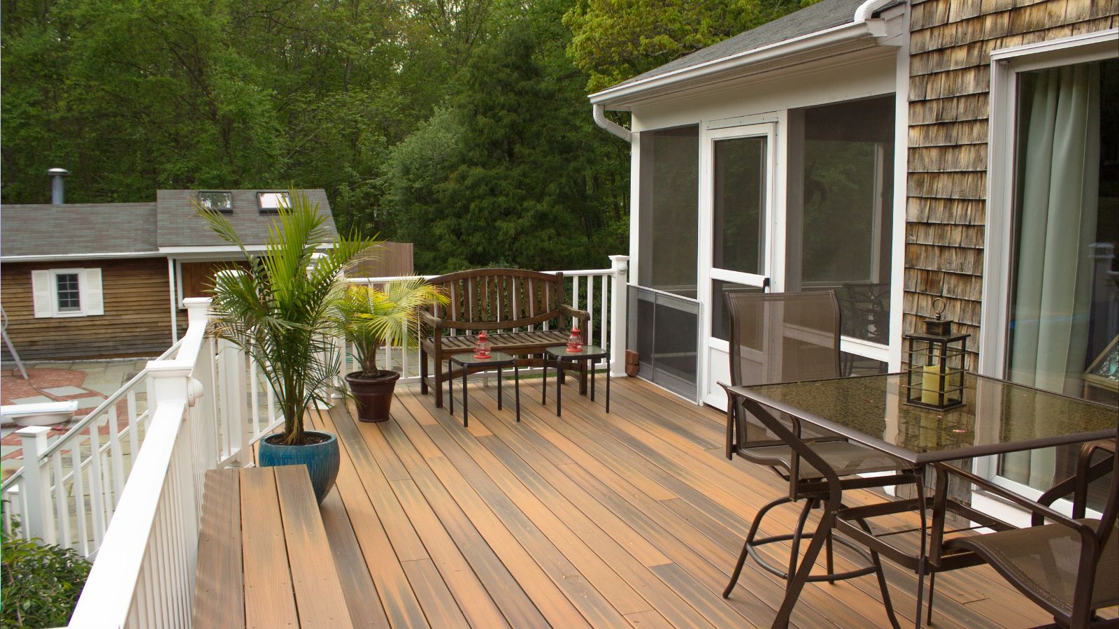
The Picture Frame Border Only Works When the Deck Board Lines Are Clean
A picture frame border can make a deck look more finished right away. It gives the outer edge a stronger frame and helps the field boards feel intentional. On composite decking, especially, it sharpens the design and draws more attention to every deck board line, which is why layout precision matters so much here.
Still, this detail depends on good planning. If the frame is uneven, the board spacing shifts, or the staircase connection feels awkward, the border tends to highlight those problems rather than hide them. That is the catch with decorative details. They look best when the structure is already doing its job. In New Jersey, that starts below grade, because deck footings typically need to extend below the frost line, which commonly means roughly 36 inches in southern areas and closer to 42 inches in colder northern conditions. Concrete footings also need to extend below the frost line to help prevent shifting over time.
This is also where a solid deck framing guide becomes useful. Before a homeowner gets pulled too far into colors, decor, or more inspiration from saved photos, it helps to understand how beams, posts, board direction, and edge details affect the finished appearance.
Composite Decking Opens Up More Deck Color Options
Wood has beauty that many people still prefer, especially cedar, but composite decking offers steadier tones, fewer surprises across the surface, and easier coordination with railing systems and trim. Decking surfaces in New Jersey are often made of composite materials or PVC because they offer lower maintenance than wood. For homeowners comparing wood and composite side by side, that consistency is one of the biggest practical advantages.
Before comparing shades and sample boards, it helps to keep a few practical numbers in mind.
| Practical factor | Typical range | Why it matters |
| Composite decking warranty | 25–50 years | Helps explain why many homeowners prioritize long-term color stability and lower maintenance |
| Composite joist spacing | 12–16 inches on center | Tighter spacing supports cleaner lines, better board performance, and more consistent surface appearance |
| Materials share of a professionally installed deck | Up to about one-third of total project cost | Useful when comparing whether premium color options or upgraded boards fit the overall budget |
That matters when homeowners want deck color ideas that feel modern without looking cold. Soft browns, warmer grays, darker chocolate tones, and subtle blend patterns can all work well depending on the house and the amount of sun. In hotter settings, lighter shades can stay more comfortable underfoot because darker boards absorb more heat.
A two-tone deck built with composite decking can look especially sharp when the contrast is thoughtful. A darker border with a mid-tone field board often feels cleaner than a sharp contrast between very light and very dark shades. Bright white railing can work too, though it usually looks best when the home’s exterior already has light trim or a crisp, classic style. When the color split respects the size and shape of the deck, a two-tone approach can add curb appeal and make the overall design feel more distinctive. One of the most useful tips here is to compare the full palette in daylight instead of judging each tone on its own.
Composite decking now gives homeowners more textures and shades than they had a few years ago. That means there is more room to choose a tone that actually fits the site.
Deck Color Should Relate to the House, Not Just the Sample Board
This is where a lot of people go wrong. They pick a color they like in isolation and forget to compare it to the brick, siding, concrete, door color, railing style, and the overall tone of the yard. A deck does not exist in isolation. It becomes part of the full outdoor living space.
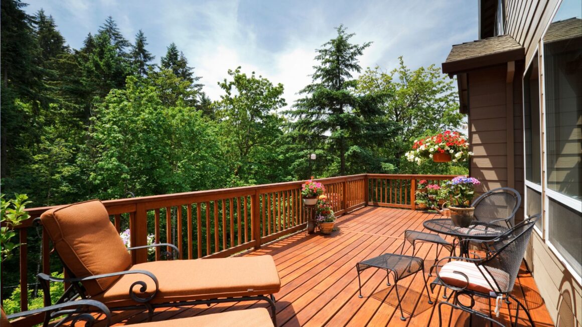
Warm browns often complement brick and natural wood elements well. Cooler shades can suit a more modern house, especially if the railing and decor are simple. Darker tones can add depth but may feel heavier in a smaller space. Lighter tones can open the room visually, but they may not give enough contrast if everything around them is already pale.
Small Features, From Railing Lines to a Tiki Torch, Can Change the Whole Appearance
Sometimes the biggest difference comes from the smaller features around the deck itself. The railing profile, staircase width, the line of the border, nearby fences, lighting placement, and even something as simple as a tiki torch setup can change how the main color feels.
That is why smart deck design pays attention to context. The deck board color matters, but so do the surrounding elements. A warm tone can look richer next to black railing. A subtle blend may feel flat if every other feature on the site is muted. A rustic house can carry deeper wood tones well. A sleeker home may prefer cleaner, cooler shades.
What Matters Most in the End, Before You Look for More Inspiration
The best deck color ideas are the ones that still look right once the deck is built, furnished, and lived with. They hold up in morning light, wet weather, and normal daily use.
That usually happens when the structure is right first. The frame makes sense. The board layout is clean. The railing feels balanced. The materials suit the site and do not invite early moisture problems or rot. The hardware and connections also need to match the climate, which is why corrosion-resistant connectors, proper flashing at the ledger, and code-compliant attachment details matter so much in New Jersey. Adequate ventilation beneath the deck matters too, especially during humid summers, because trapped moisture can lead to mold and shorten the life of the structure. Then the color has something solid to sit on.
A beautiful two-tone deck or a clean single-tone finish can absolutely inspire a project. The real win is when color, craftsmanship, and structure blend into a space that feels calm, useful, and built to last.