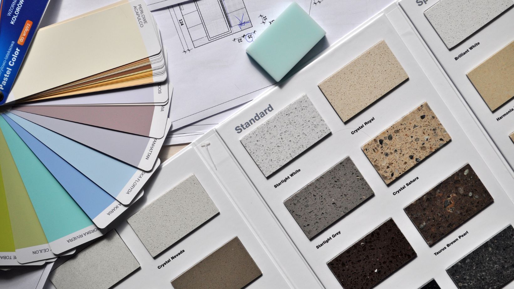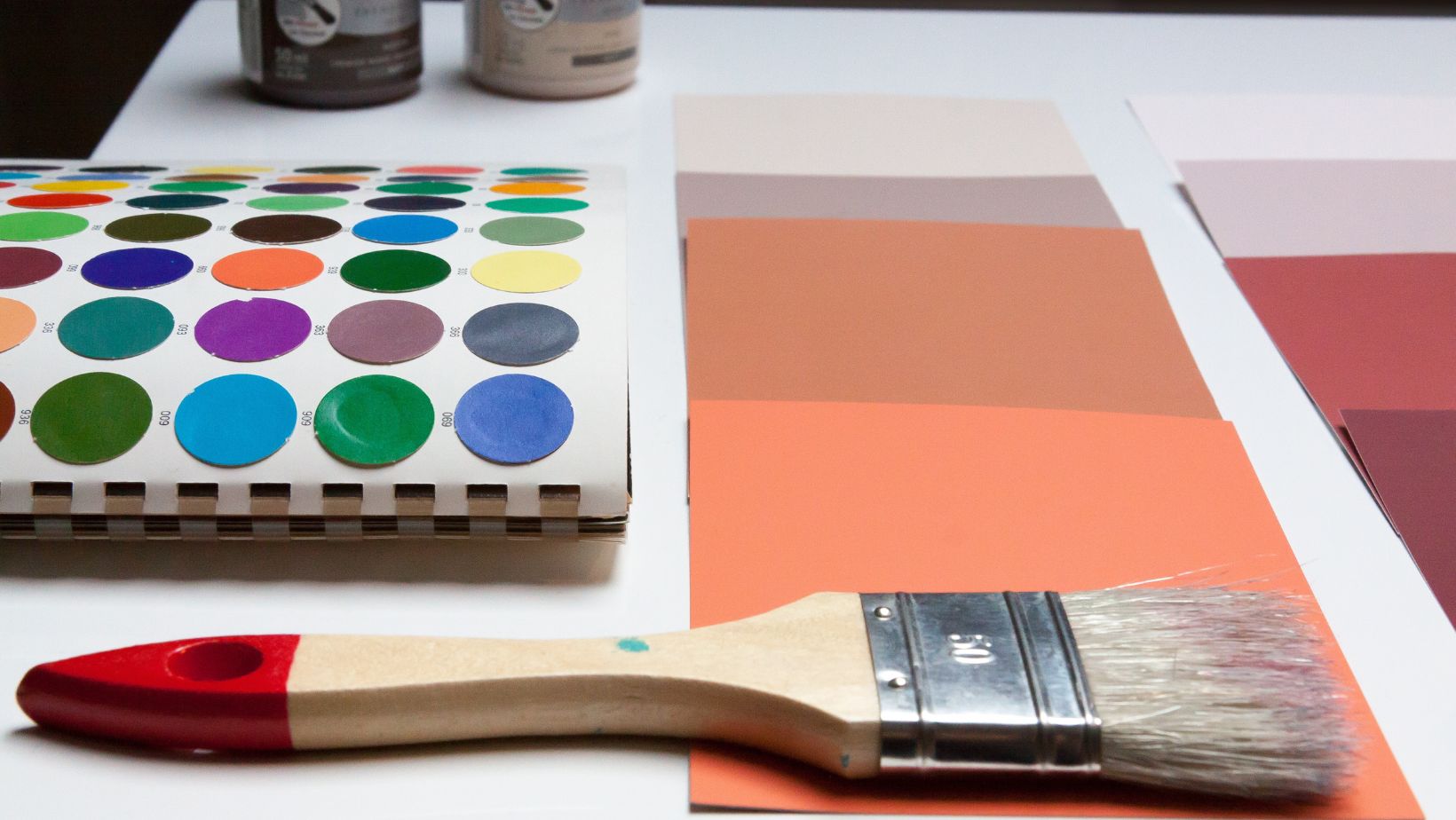
It’s a universal truth that colors have the power to invoke a wide range of emotions. They can transport us to distant memories, stir emotions deep within, and even influence our decision-making process. Whether we’re aware of it or not, colors play a pivotal role in our daily lives, shaping our interactions, moods, and perceptions. So, it’s no wonder that the choices we make concerning colors, especially in our living spaces, can turn the ambiance from dull to absolutely dazzling.
The Emotional Spectrum of Colors
Before diving into the magic of transforming spaces, it’s crucial to understand the emotional weight that different colors carry:
- Red: Often associated with passion, energy, and excitement.
- Blue: Brings feelings of calmness, serenity, and trust.
- Yellow: Evokes happiness, optimism, and warmth.
- Green: Symbolizes nature, growth, and tranquility.
- Purple: Represents luxury, creativity, and mystery.
Having this knowledge is essential for anyone, from the professional painter Sydney relies on to the budding interior designer because it forms the foundation for every color decision made.
Why Colors Matter in Your Space
Setting the Mood: Want a calm and serene bedroom? You might consider soft shades of blue or green. Looking to energize your home office? Splashes of yellow or orange can do the trick. By understanding the mood you want to evoke in each room, you can make informed color choices.
Size Perception: Colors can play optical tricks on our eyes. Lighter hues can make a small room feel spacious, while darker tones can create an intimate setting.
Flow and Connectivity: Colors can also guide the flow of your home. Using a consistent color or complementary shades across rooms can ensure a seamless transition and a cohesive look.
Unlocking the Potential of Neutrals
Neutral doesn’t mean boring. On the contrary, neutral colors can serve as a canvas, allowing other elements of the room, like furniture or art, to take center stage.

- White: Pure, clean, and versatile. It can be cool or warm, depending on the undertone.
- Beige: This warm hue can add coziness to any space.
- Gray: An adaptable color that can lean either warm or cold and can be paired with a multitude of other shades.
Pair neutrals with bold accents for a modern look or with soft, pastel tones for a vintage feel.
Using Color in Decor
While paint is a primary way to introduce color, it’s not the only method:
1. Furniture: A bold-colored sofa or a muted coffee table can define the room’s vibe.
2. Textiles: Think curtains, cushions, rugs, and bedding. These can be changed seasonally to refresh the look.
3. Art and Decor: Art pieces can introduce a myriad of colors and tie together different elements of the room.
Tips for Color Harmony
1. The 60-30-10 Rule: For a balanced color scheme, decorate 60% of the room with the dominant color, 30% with a secondary color, and 10% with an accent color.
2. Use a Color Wheel: Opposite colors (like blue and orange) create dynamic contrasts while neighboring colors (like blue and green) give a harmonious feel.
3. Test Before Committing: Always test paint colors in a small patch before going all out. Observe it in different lights throughout the day.
Avoiding Common Pitfalls
- Following Fads Blindly: While it’s great to be trendy, it’s crucial to pick colors that resonate with you and not just because they’re ‘in.’
- Not Considering Lighting: Natural and artificial lights can drastically change how a color looks. Always consider the lighting situation of your room.
- Forgetting the Ceiling: The ‘fifth wall’ of any room offers more opportunities for creativity. Consider painting it a lighter shade of the wall color or even introducing a bold accent.

From setting the mood to defining perceptions, the colors we introduce into our spaces have profound impacts on how we experience them. The journey from dull to dazzling is not just about slapping on a new coat of paint but understanding the emotions, aesthetics, and optical effects that color choices bring along. Whether you’re embarking on a DIY home makeover or seeking the expertise of professionals, always remember color is magic. Harness it wisely!


